I’M THE KIND of diner who’s always on the hunt for the new place in town. I follow the foodie social media groups to find out what everyone’s talking about (and, admittedly, to get the latest gossip). But I’m also the person who picks something on the menu I like and sticks with it.
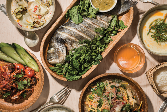
So I was anxious to try Leo’s in Santa Fe after it opened in August, although the long lines to get in the former auto shop turned restaurant kept me at bay until a dreary Friday night last fall. “Maybe the rain kept people away,” I told my wife. And, by some grace of the foodie gods, it had. The collards, satay ayam, and catfish sum tum were so good, we came back twice more, ordering the collards and satay each time over the next few weeks. When Esquire recognized it as one of the country’s best new restaurants, I was in full agreement—and I’m excited to have Leo’s grace our cover for this month’s “Hot Seats” feature.
It’s a fitting introduction to the new look for New Mexico Magazine as well. Redesigns can be a lot like stepping into a restaurant for the first time—thrilling, yet also daunting, since change can be difficult. Maybe that’s why I gravitate to something familiar on the menu.
Chef Nath Gyallay-Pap’s turmeric noodles and pad thai are popular picks at Nath's Inspired Khmer Cuisine.
Photograph by Tira Howard.
Captained by art and photography director John McCauley, the process started last summer as a desire to elevate what we were already doing editorially while improving the reader’s experience. What began as ideas became sketches that eventually turned into draft concepts, printed out and hung in his office. Occasionally, he’d say, “Hey, I’ve got something to show you.” Like a chef developing recipes, he was always testing fonts, colors, and designs—some worked, some didn’t—until it felt right. “A modern, clean, and elegant design that reflects the beauty of New Mexico,” he calls it.
What you’ll notice is a new body typeface, Publico Text, built for comfortable reading. The overall design refreshes the magazine’s architecture (“One of Our 50 Is Missing” is now up front; Tasting features “What To Eat This Month”) by creating more white space along with additional points of interest per page and a more strategic use of color, plus deploying a less-is-more approach to visual storytelling.
One of McCauley’s favorite aspects was creating a color palette that felt special. “I decided to give each color a name that felt like a part of New Mexico: adobe, turquoise, hollyhock, gold,” he says. “It was a fun way to add some personality.”
I’m hoping you’ll eat up this reimagined recipe for New Mexico Magazine—no reservations required.
Read more: Start with Leo’s in Santa Fe, where a former auto shop now anchors one of the city's most talked-about new dining rooms.